Exotic surface finishes are rare decorative materials, shagreen, shell, mother of pearl and straw marquetry among them, applied by hand to furniture, panelling and lighting: prized, since the eighteenth century, for a depth no machine can reproduce.
There is a moment that happens in our studio more than any other. A client walks past a sample board on the bench, sees a panel of pale ray skin or a drawer front in laid straw, and stops. Conversation pauses. A hand goes out almost without permission — the fingertips settle on the grain, move slowly across it, and there is a small silence while the surface is read by touch rather than sight. These are materials people cannot help reaching for, and that reaching tells you everything. A surface like this carries the memory of its origin, ages with an unusual sort of beauty, and quietly refuses to be reproduced by any machine.
Shagreen, shell, mother of pearl and straw marquetry are among the most compelling of these. Each has a history rooted in French decorative arts — the great ébénistes of the eighteenth century favoured them precisely because they were difficult to work and impossible to imitate. The very things that frustrated those makers, the fragility, the slowness, the refusal of any two pieces to behave the same way, are the things that make the finished surface sing. Today the same qualities keep them relevant for contemporary interiors: rarity, depth of surface, and the unmistakable signature of a hand at work.
At Make Bespoke Studio we apply these finishes to furniture, panelling, lighting and object commissions. What follows is a guide to each material — what it is, where it comes from, and what it asks of you in practice.
Shagreen
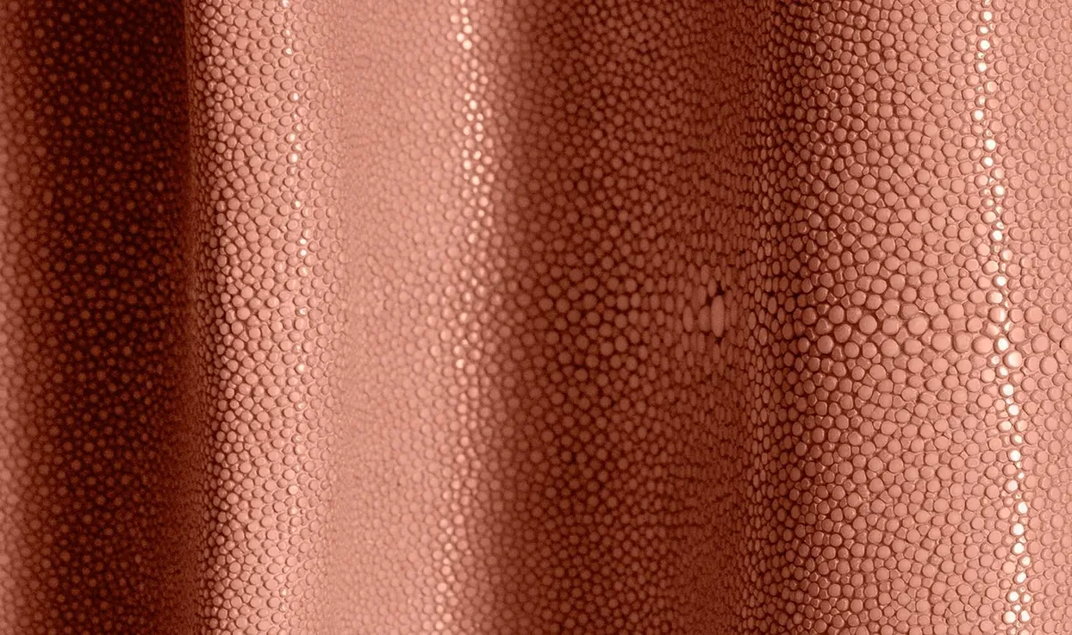
Shagreen is the skin of the ray fish, prepared and dyed to produce a surface of extraordinary tactile richness. Run a thumb across it and you feel hundreds of tiny raised beads — each one a calcified denticle, packed tight like fish roe set in stone — and that close-knit pebbling catches light differently at every angle. No two hides are alike. The grain swells towards the centre of the skin and tightens at the edges, so each panel carries a quiet complexity that flat materials never reach.
The material has been used in European furniture since the seventeenth century, when it arrived from the Ottoman Empire as a luxury commodity. By the Art Deco period it had become a defining material of the style: Jean-Michel Frank lined entire rooms in it, producing interiors of a severe, almost mineral calm. Contemporary uses are broader. We set shagreen on cabinet door panels, drawer fronts, table tops and desk surfaces, where its texture gives the eye and the hand something to rest against amid smoother neighbouring materials such as lacquer, metal or natural stone.
We work with shagreen in its natural grey-green tone as well as a full range of dyed colours — deep charcoal and midnight blue through to sage, warm ivory and blush. The dye soaks into the grain evenly rather than sitting on top of it, so the colour reads as something the skin always was rather than something done to it.
Shell veneer
Shell veneer — usually pen shell, paua or capiz — produces a surface of exceptional luminosity. The material is optically active: it reflects and refracts light from within, so the iridescence shifts and travels as you move past it. In lamplight a shell-veneered surface seems lit from somewhere just behind its own skin.
Laying shell asks a great deal of the maker. Each fragment is cut and set by hand, edge against edge, into panels that are then bonded to the substrate, and the joins must close so tightly that the eye loses them. The surface is ground dead flat before polishing, because on something this reflective the smallest dip or proud edge catches the light and announces itself. Done patiently, the result has real presence in a room.
Shell takes especially well to lacquer — a technique with roots in Asian decorative arts — the luminosity held beneath a film of clear gloss that lends the whole surface depth. We also leave it raw and uncoated when a client wants the texture left honest underhand rather than sealed behind a sheen.
Mother of pearl
Mother of pearl is the inner nacre of certain mollusc shells — abalone, freshwater mussel, trochus — and it shares shell's optical magic while keeping a character all its own. Where pen shell throws a bold, dramatic iridescence, mother of pearl shimmers finer and more opalescent, cooler and more restrained, the difference between a flame and the inside of a cloud.
We use it two ways on furniture. As inlay, set into routed channels in the substrate alongside other materials; and as veneer, laid in sheets across a whole panel. Inlay — the setting of small pieces against brass wire, ebony or a contrasting wood veneer — carries a long lineage in both European and Asian decorative arts, and lets us place the reflective quality exactly where a composition wants it rather than spreading it evenly across a face.
As a veneer it demands the same discipline as shell: tight joins, careful grinding, polishing held under control. I still remember leaning a finished cabinet door towards a single lamp and watching the nacre answer the light in a slow, contained glow — that is the moment you know the grinding was worth the hours. Under directed light it is entirely its own thing.
Straw marquetry
Straw marquetry is perhaps the rarest of these finishes — a technique that nearly died out in the twentieth century and survives now in only a handful of specialist workshops. Natural rye straw is harvested, split down the length of the stem and opened flat, and the inner face, which carries its own faint sheen, becomes the working surface. Each strand is cut and laid into geometric or figurative patterns, the joins drawn tight and the angles held true, work so exacting it belongs squarely in the tradition of haute marquetry. There is a particular quiet to a bench laid up for straw: the smell of it is dry and faintly sweet, like a barn in late summer, and the laying goes strand by patient strand.
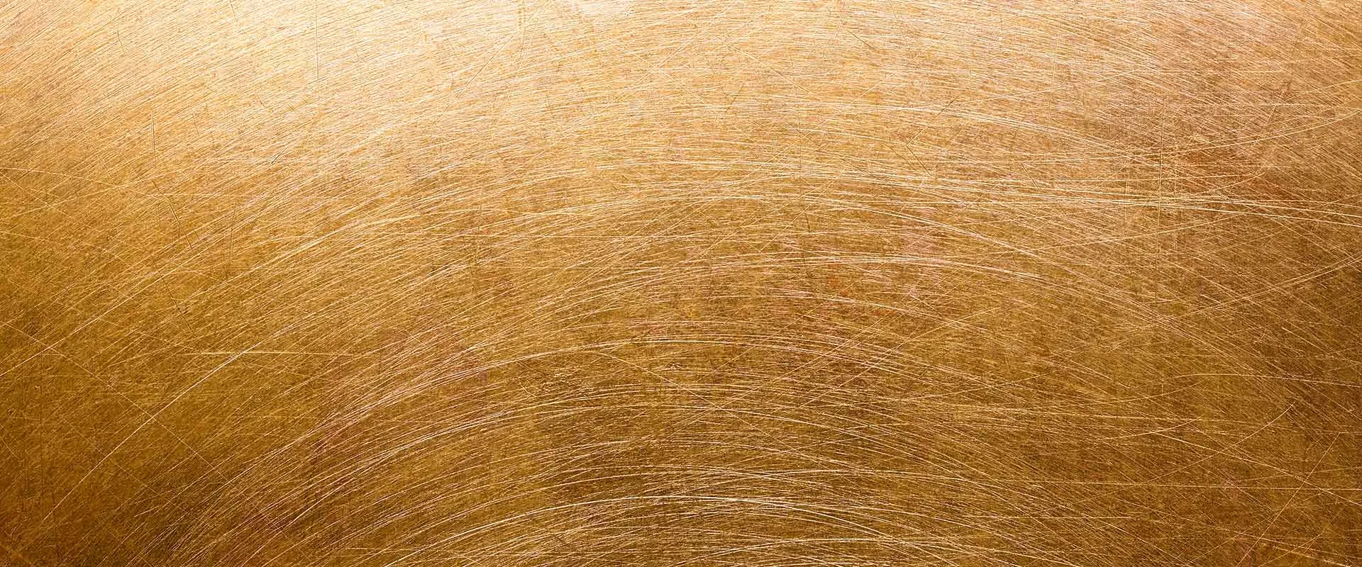
The natural palette runs from warm gold through amber and honey to deep bronze, depending on the age and species of the plant. Individual straws can also be dyed before laying — blue, green, red, black — for complex polychrome compositions. Because the grain of each strand is turned against its neighbour, the panel shimmers and shifts as you cross the room, an almost quilted play of light when the sun rakes low across it.
The Art Deco designers, Jean-Michel Frank and Serge Roche chief among them, used straw extensively. Its return to contemporary work is driven by a renewed hunger for materials with genuine craft depth and honest rarity. A straw marquetry panel says something no industrial process can copy, and it says it without raising its voice.
Specifying exotic finishes
Each of these materials wants to be brought into the conversation early. The structural questions — weight, substrate, how the surface will move with the seasons — are best settled before the detailed design hardens around them. A few practical constraints are worth knowing from the outset:
- Shagreen comes in hide-sized sections, so a large surface needs its joins planned and placed where the eye will forgive them
- Shell and mother of pearl are fragile in transit and travel in protected crates; wherever possible we reserve them for fixed surfaces rather than moving doors or lids
- Straw marquetry dislikes direct sun — UV slowly bleaches its colour — so it is happiest set away from a window's full light
- All four take a protective lacquer topcoat that consolidates the surface and makes living with the piece far simpler
We work with trusted specialist suppliers and lay every one of these finishes in our London studio, which means we hold the quality in our hands from raw material to finished piece. We are glad to talk through which finish suits a given application, prepare sample boards for you to handle and approve, and carry the work all the way through to installation. Come and put your hand on one — it tends to settle the question faster than any drawing.
.webp)