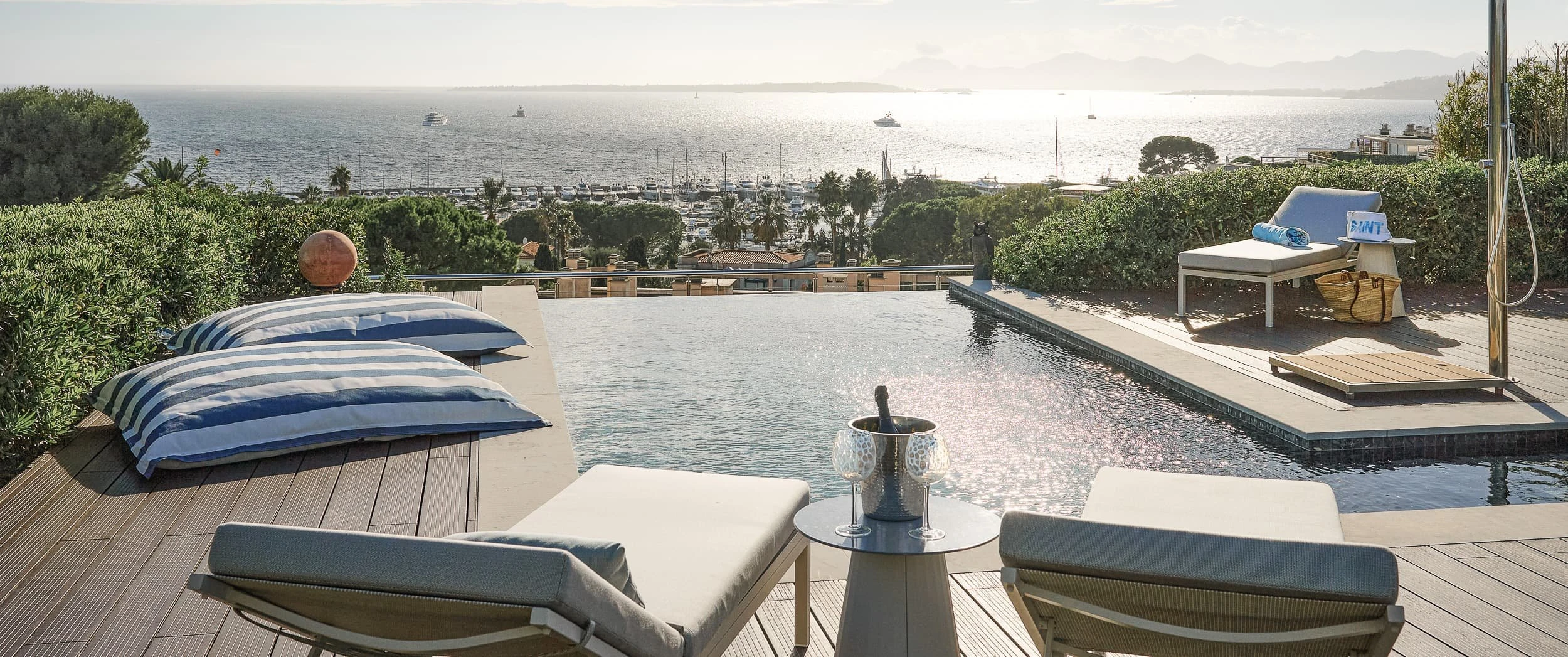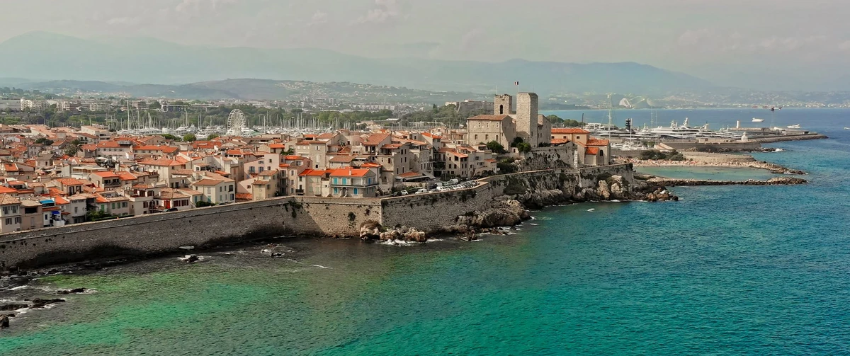
Antibes has a particular kind of light. Perched between Cap d’Antibes and Juan-les-Pins, the penthouse looks over the old port where morning is silver and late afternoon turns syrupy and golden. From the outset we treated the apartment as a lens for that panorama — quietly edited, textural rather than shiny, and tuned so the view remains the headline.
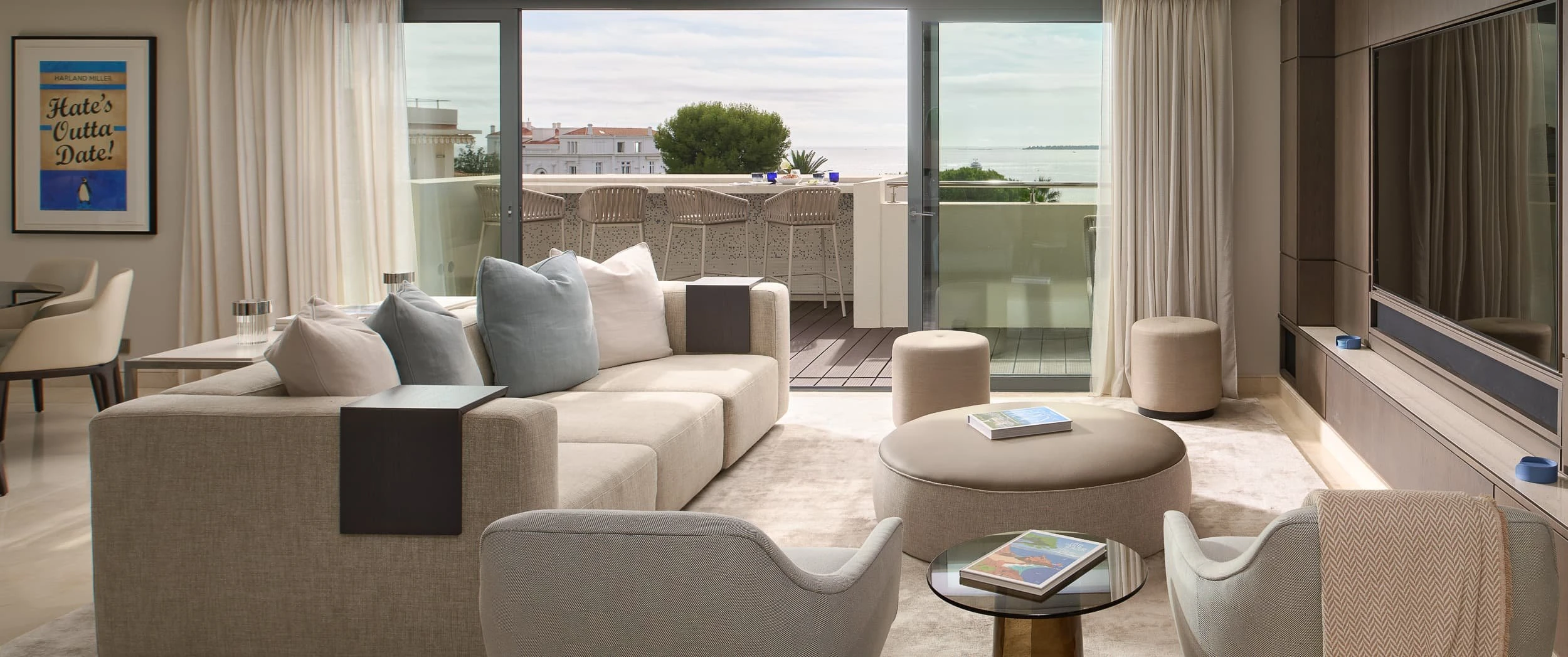
The project came through one of Lucinda Taylor’s longstanding clients, who value calm and beautifully made things over noise. They asked for a clean look throughout, with furniture that feels indulgent to sit in yet visually restrained, and materials that behave well in a marine climate. Lucy’s answer was a disciplined language of low, generous volumes, softened junctions and diffused finishes. Our role at Make Bespoke Studio was to translate that intent into pieces with the right posture, touch and longevity.
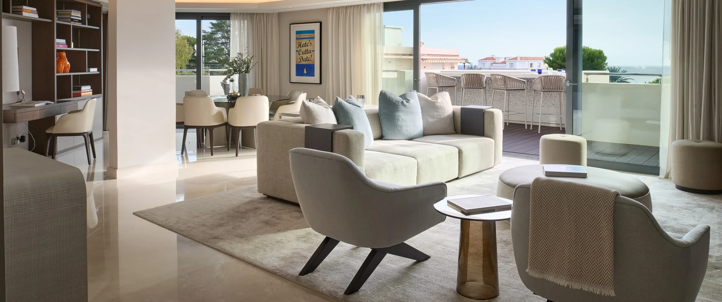
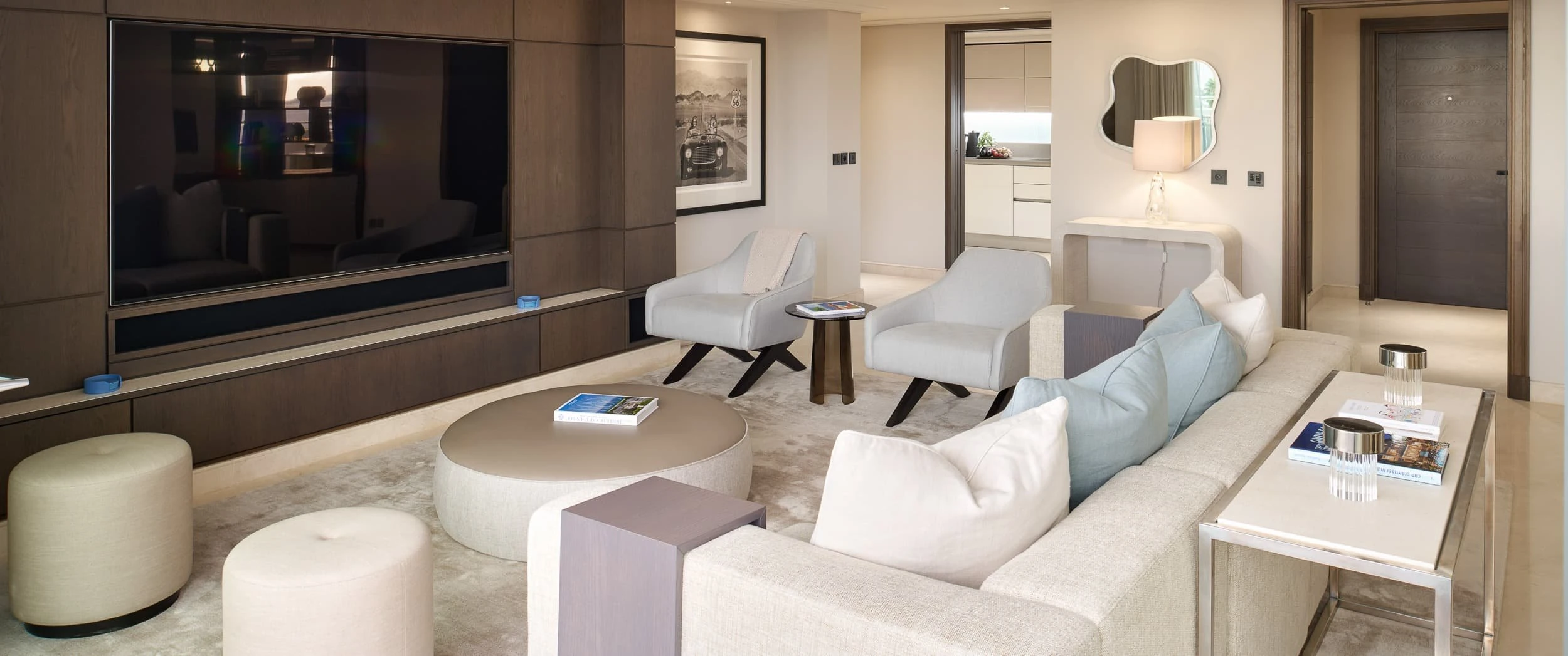
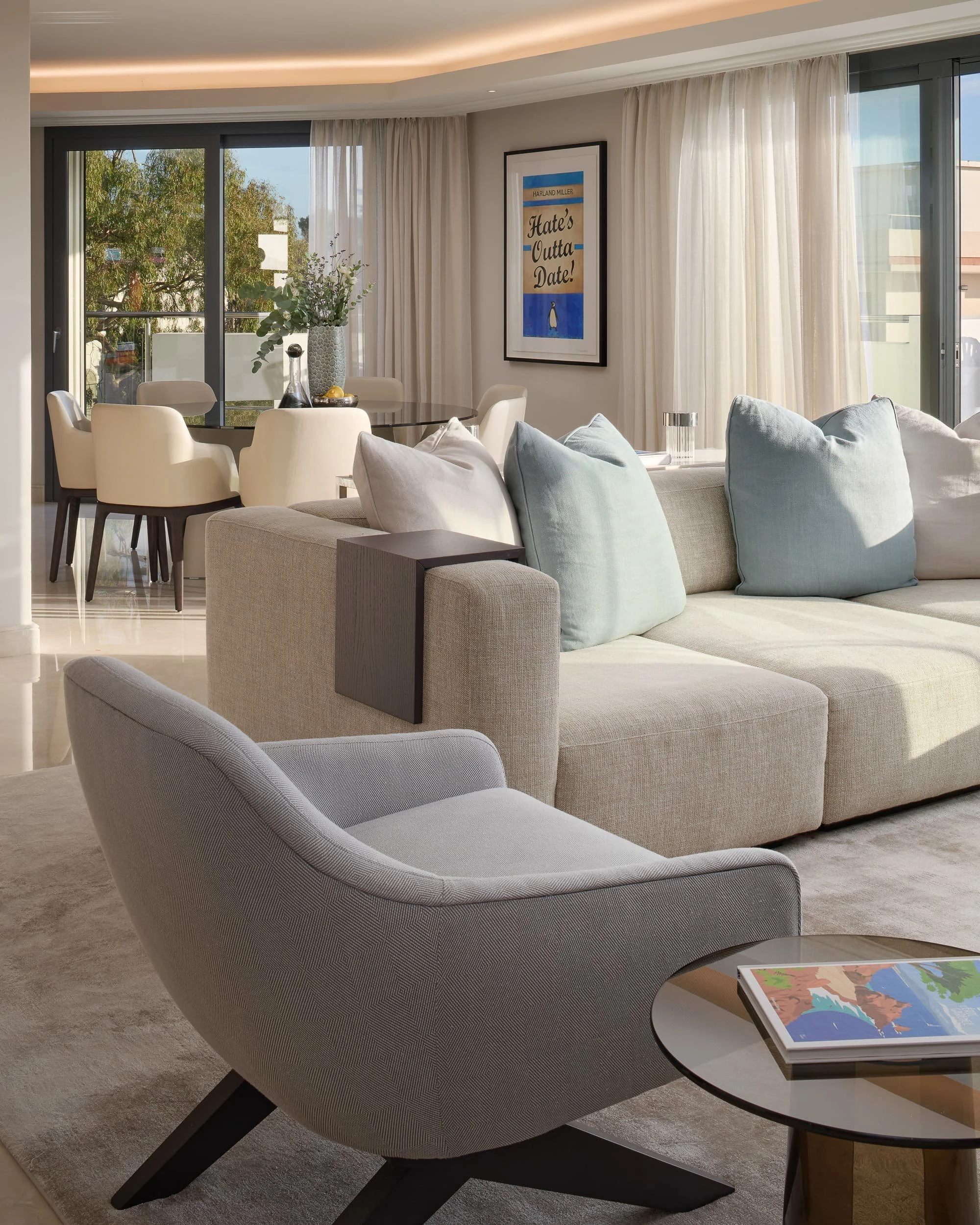
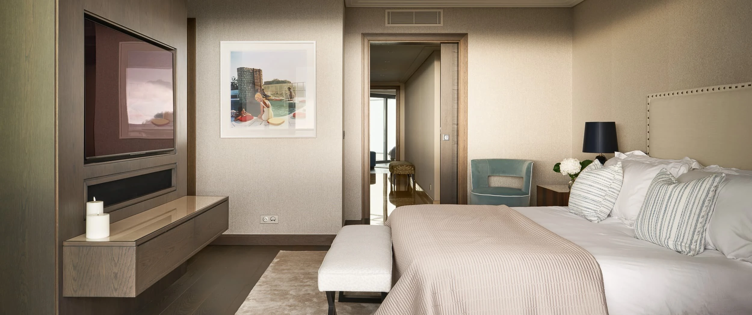
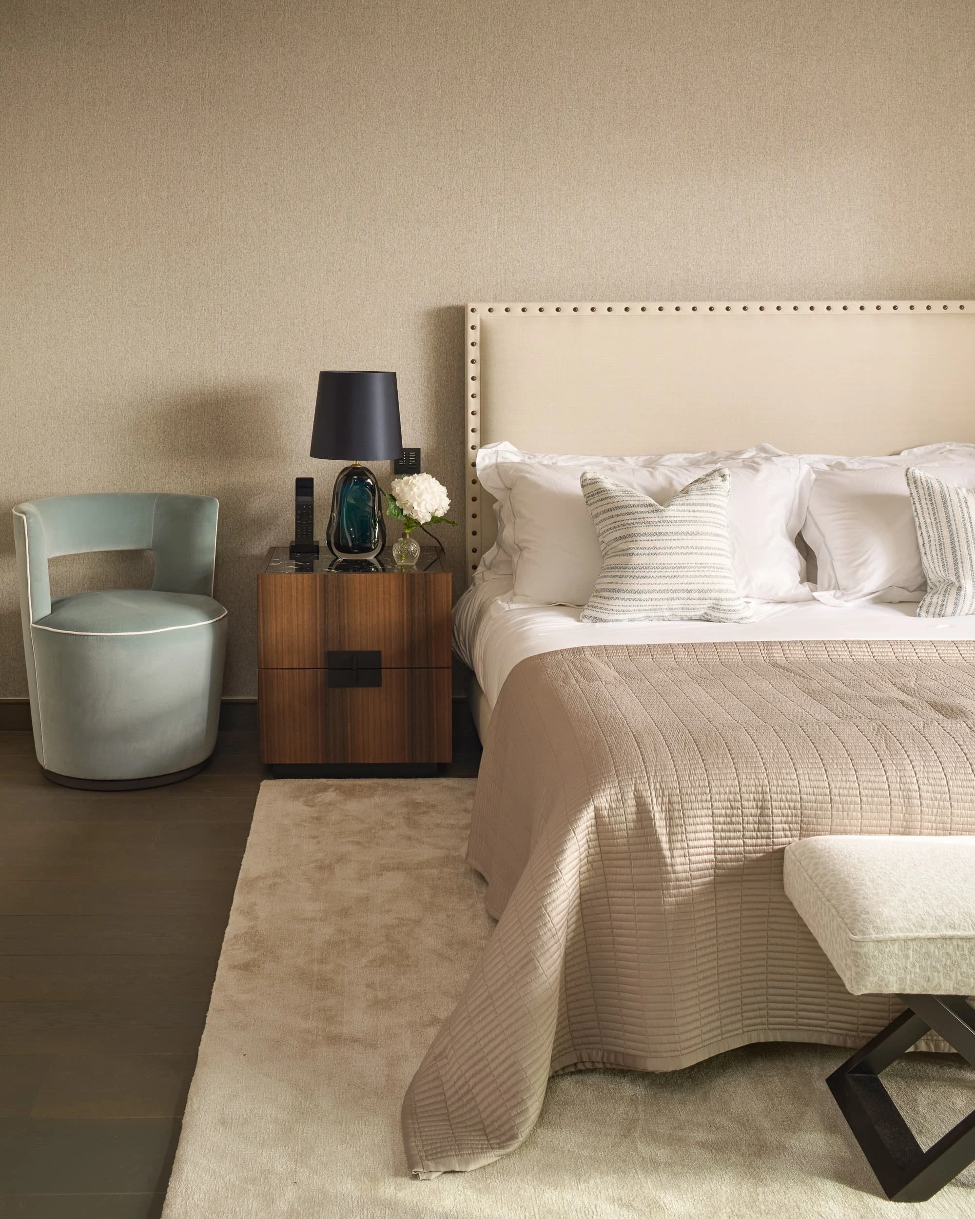
Outside, the roof terrace dissolves into the infinity edge and the bay beyond. Inside, cove lighting floats the ceiling, sliding glazing stretches the sightline, and built-in joinery sits neatly with slim shadow gaps. The living spaces are anchored by broad, low seating on a vapour-toned rug, while compact armchairs and slender tables bring a softer rhythm. In the principal bedroom a quietly upholstered headboard and a floating media ledge keep the eye moving straight to the horizon.
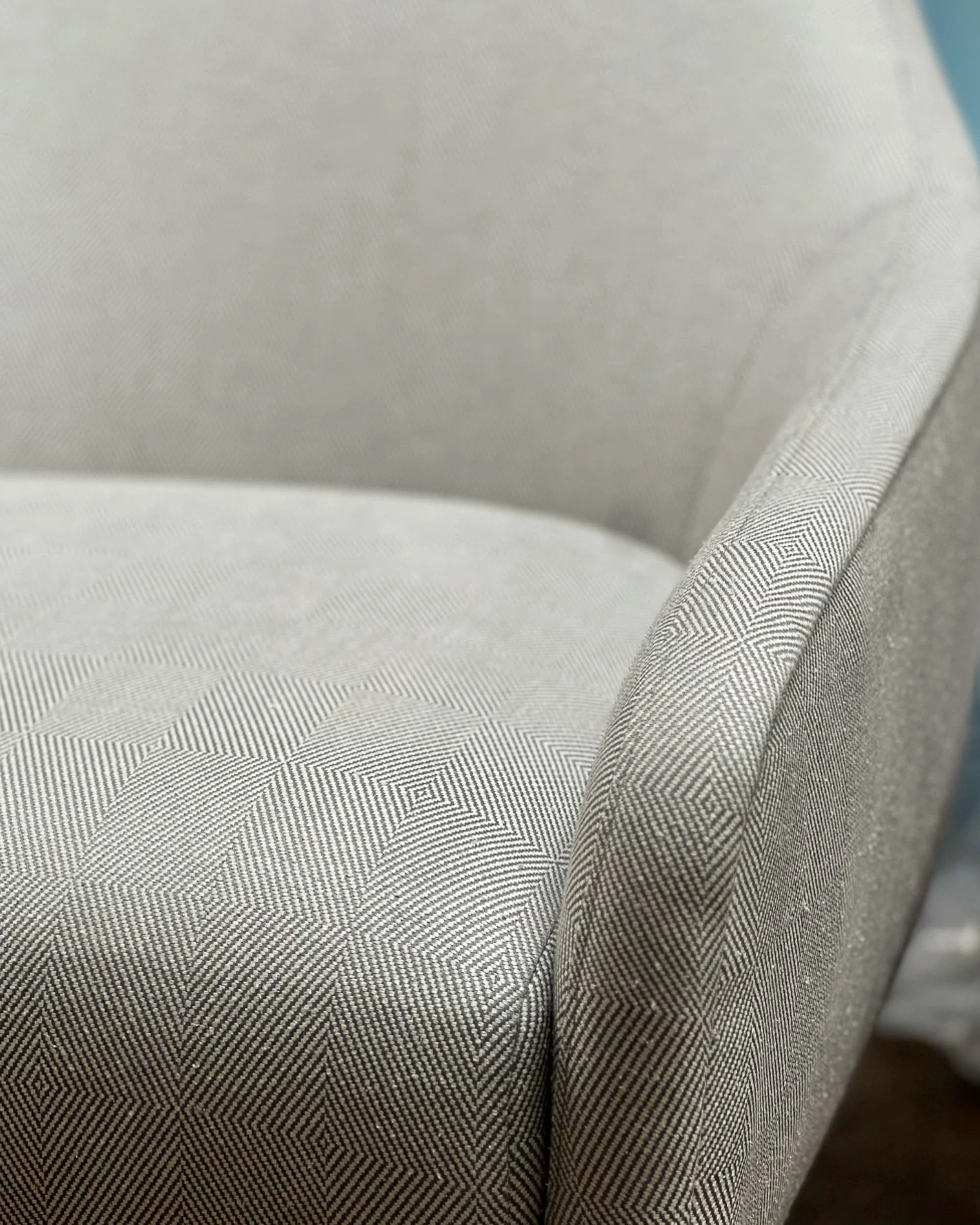
Our bespoke upholstery consists of a pair of lounge chairs in Sanremo Ecru, built on kiln-dried hardwood frames with elasticated suspension and CMHR foams wrapped for that relaxed, sink-in feel that still holds a crisp line. The fabric choice is deliberate: Sanremo Ecru has a calm weave that stays composed under strong lateral light from the glazing, so the silhouette reads tailored rather than slouchy.
In the bedroom, the bench upholstered in Kanoko Soba by de Le Cuona introduces a tiny ripple of texture — enough movement to animate the neutrals without ever feeling busy. A firmer core and a tight, disciplined pull keep everything immaculate in the morning sun.
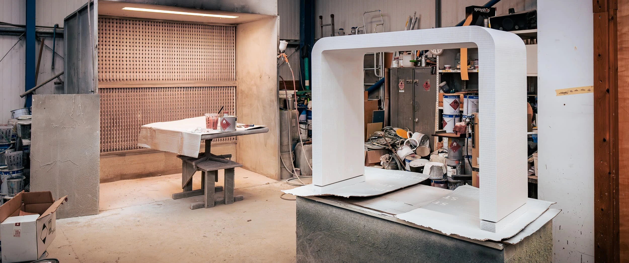
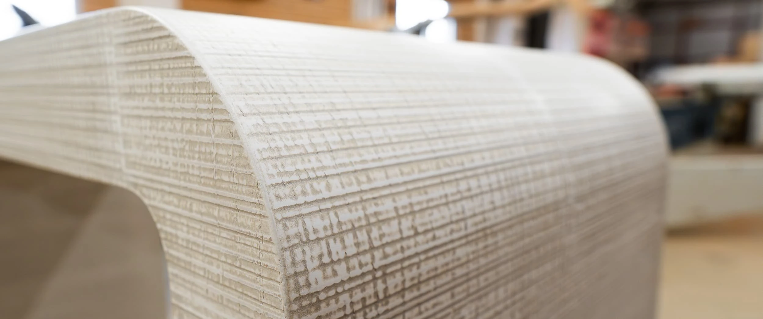
We introduced rough-sawn European oak to the console design to add grain and shadow to a restrained palette. We produced a series of control samples to make sure we had the right scale and colouring — testing kerf depth and spacing, refining the denibbing passes until the surface felt tactile but never snaggy, so the texture reads as a fine architectural shadow rather than a rustic stripe.
Only when every variable settled perfectly did we lock the specification. The finished piece is mitred and internally reinforced so it reads as a clean monolith, keeping the line light.
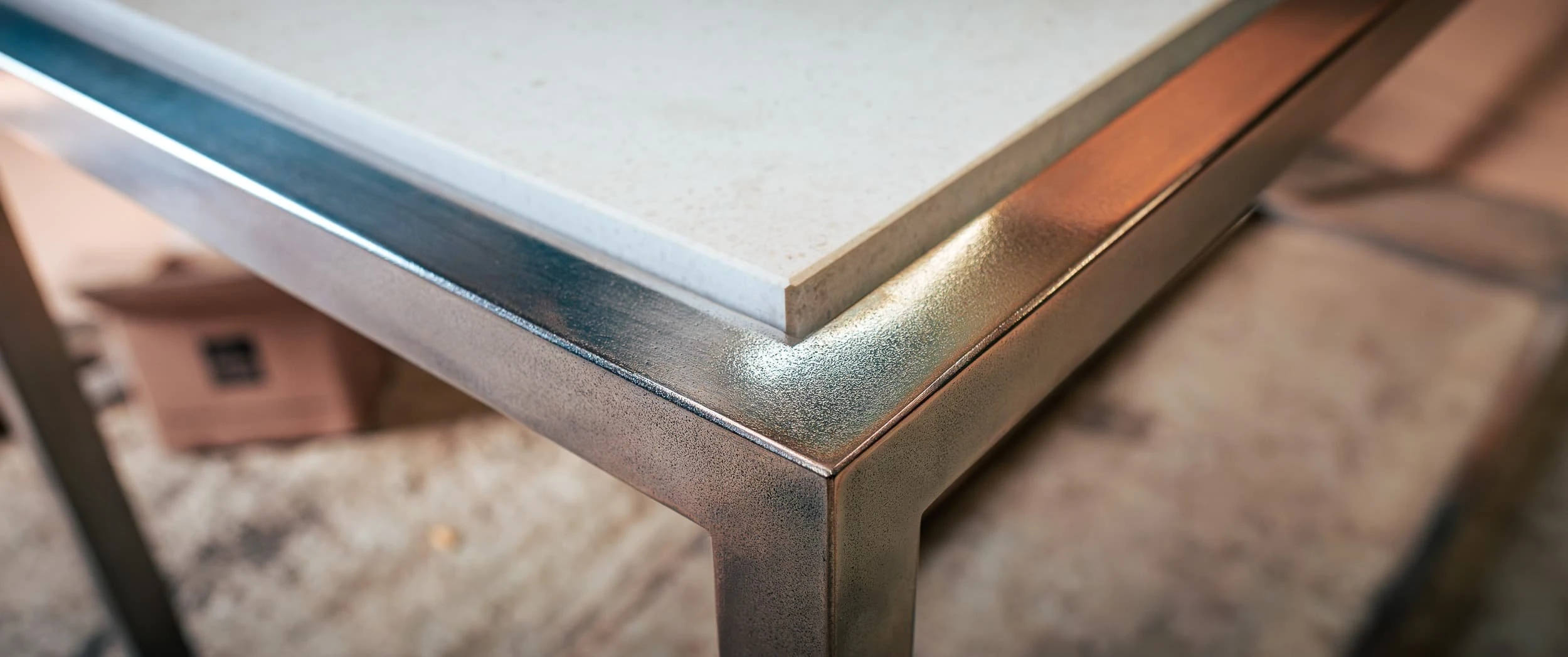
Stone and metal complete the material story. The living area’s statement console pairs 30 mm honed travertine with a patinated silver frame, so the mineral figuring brings natural depth while the hand-aged lustre behaves like jewellery at dusk without ever glaring by day. The stone sits atop a beautifully welded steel frame — luxury furniture that’s beautiful on the surface and sensible beneath it.
Lucy works iteratively and with immense care. Cutting plans were rotated to control fabric sheen, and seam placement was coordinated with major sightlines so nothing distracts from the view. That diligence is felt rather than announced; it is the difference between a space that looks calm and one that stays calm as the light moves and the space is lived in.
Sustainability and serviceability run through the build. We use FSC-certified timbers, low-VOC finishes and UK/EU FR compliance on all upholstery. Components are designed to be maintained — glides replaceable, cushions accessible, stone mechanically fixed — so pieces age gracefully in sea air. The intention is not just to look good on day one, but to keep performing beautifully year after year.
The Antibes penthouse is crisp by day and richly layered by night: a disciplined envelope animated by grain, weave and soft shadow. It’s a project where bespoke upholstery and crafted timber and stone work in concert with place and client. Discreet, durable and unmistakably bespoke, it’s the kind of luxury furniture that doesn’t shout, because it doesn’t need to.